How to Create Email Templates: A Step-by-Step Guide
A reusable email template system helps teams send faster without breaking brand rules, accessibility, mobile rendering, or personalization. This guide walks through planning, modular design, email-safe HTML, dynamic content, testing, and maintenance.
 Sohail Hussain13 min read
You are probably dealing with some version of this already. A campaign needs to go out today, someone duplicates an old email, swaps in new copy, and hopes nothing breaks in Outlook or on mobile. Then the replies start. The button looks off-center. A name field is blank. The footer is outdated. Next week, the same cycle repeats.
That cycle is why learning how to create email templates matters. Not just one nice-looking newsletter. A template system. Something your team can reuse without rebuilding layouts, breaking brand rules, or relearning the same inbox quirks every send.
A good system gives marketers speed, designers consistency, and developers fewer emergencies. It also makes future changes easier. If you update a product line, change compliance language, or add personalization rules, you update modules instead of redesigning every email from scratch.
Why Ad-Hoc Emails Cost More Than Time
Ad-hoc emails feel fast because you can copy, edit, and send. In practice, they create hidden work. Teams remake the same sections, introduce inconsistent spacing, and miss details that a stable template would have locked down from the start.
That cost shows up in three places. First, production time. Second, quality control. Third, campaign performance. If every email starts from a copied campaign, your team spends creative energy fixing layout decisions instead of improving message quality and segmentation.
The shift toward templates is already well underway. Adoption of automated email templates in SMBs has increased by 67% since 2018, and businesses using template systems report higher engagement while reducing average email creation time, according to data cited by Email Templates App.
Practical rule: If your team sends the same type of email more than twice, it deserves a reusable template.
The biggest mistake is treating templates as a design shortcut. They are not. They are an operations tool. A strong template system decides what can change, what should stay consistent, and what must never be edited without approval.
That matters for more than marketing emails. E-commerce teams need reliable promo blocks, product sections, and support footers. SaaS teams need onboarding, activation nudges, and lifecycle updates that look related without feeling identical. Agencies need a way to move fast while keeping client work polished.
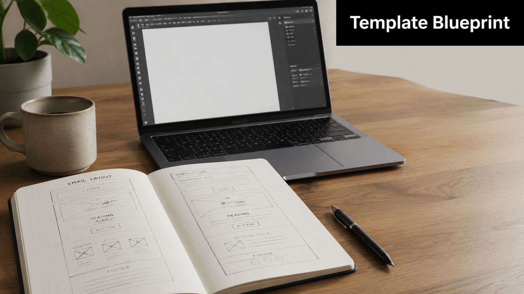
Planning Your Master Template Blueprint
Before you touch Figma, your ESP builder, or an HTML file, map the system. Most weak templates fail because the team starts with visual style before deciding what the email needs to accomplish.
Start with email categories
List the types of emails you send now, then group them by structure instead of by campaign name. You will usually find a small number of repeatable patterns.
For most SMB teams, the categories look something like this:
- Promotional emails: Sales, launches, seasonal offers, product drops, and limited-time campaigns.
- Lifecycle emails: Welcome series, onboarding, activation nudges, renewal reminders, and win-back messages.
- Content emails: Newsletters, roundups, blog digests, event updates, and educational sends.
- Transactional or operational emails: Receipts, confirmations, account notices, and service updates.
An e-commerce brand may discover it only needs one promo framework, one editorial framework, and one service framework. A SaaS company may need one product update template, one onboarding template, and one account communication template.
If your sales and marketing motions overlap, studying an expert sales cadence framework can help you think about sequencing and message purpose. The same discipline applies to email templates. Each send should have a role, not just a layout.
Define the reader and the action
Once categories are clear, answer two questions for each one. Who is this email for, and what single action should they take?
That second question keeps templates from becoming cluttered. A newsletter can include several stories, but it still needs a primary path. A trial activation email should not ask users to watch a webinar, read three posts, and book a demo unless there is a clear hierarchy.
| Email type | Primary audience | Main action |
|---|---|---|
| Promotional campaign | Past buyers or active shoppers | Shop the offer |
| Welcome email | New subscribers or new users | Explore product value |
| Product update | Existing customers | Use the feature |
| Newsletter | Engaged readers | Read the lead story |
When a template tries to support five competing goals, it usually supports none of them well.
The blueprint should also mark which parts are global and which are flexible. Logo area, spacing rules, button style, legal footer, and typography should be controlled. Headlines, supporting blocks, testimonials, and CTAs should be modular.
That is the difference between making an email and building a system. One solves today's send. The other makes next month easier.
Designing a Modular and Responsive Structure
A future-proof email is not one beautiful canvas. It is a set of reusable parts that can be rearranged without breaking the design language.
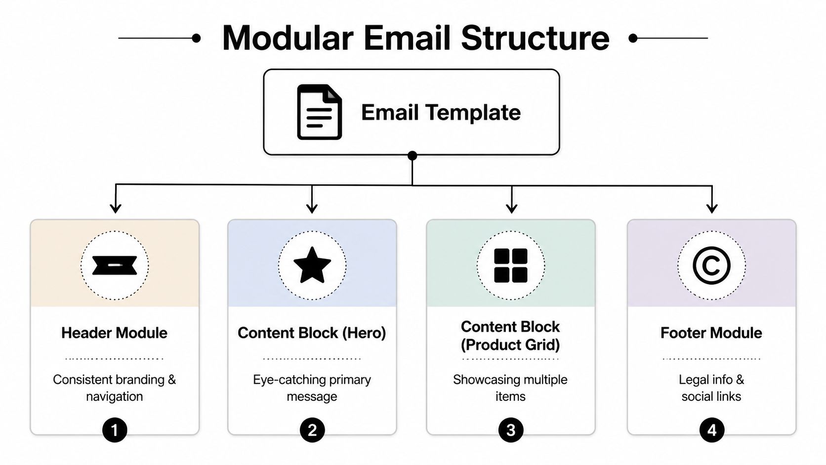
Build modules, not one-off layouts
Think in modules the way a product team thinks in components. Header. Preheader. Hero. Intro copy block. Product grid. Testimonial row. FAQ block. Footer. Each module should work on its own and also fit cleanly with the others.
The standard anatomy I recommend looks like this:
- Preheader module: Short supporting text that complements the subject line.
- Header module: Logo and minimal navigation if it serves a clear purpose.
- Hero module: One message, one image, one primary CTA.
- Body modules: Product cards, feature highlights, article summaries, proof points, or event details.
- Support module: Secondary CTA, FAQ prompt, help link, or account support contact.
- Footer module: Legal details, subscription controls, company info, and social links if relevant.
This modular approach makes versioning manageable. A marketer can swap a hero and two content blocks without touching the footer, spacing system, or brand rules. That reduces accidental inconsistency.
If you want another perspective on reusable layouts, this creating email templates guide is useful as a companion read. For teams focused on performance, keep a reference library of email templates that convert, not to copy designs block for block, but to study hierarchy, CTA placement, and content density.
Design for accessibility from the first draft
Accessibility is often treated as an audit item at the end. That is too late. Accessibility should shape the template before the first module is approved.
Build these rules into the system:
- Use readable type: Body text should stay comfortably legible on small screens.
- Preserve contrast: Light gray text on white may look polished in a mockup and unreadable in an inbox.
- Write meaningful link text: "Read the guide" is better than "Click here."
- Set alt text intentionally: Decorative images can be minimal. Product, instructional, or promotional visuals need descriptive alt text.
- Keep hierarchy obvious: Headings, spacing, and button treatment should signal priority without relying only on color.
- Avoid image-only messaging: If the core offer lives inside one graphic, many recipients will not experience the message clearly.
Accessibility is not a separate version of the email. It is what makes the main version usable.
Responsive design belongs in the same conversation. Modules should stack cleanly, buttons should remain thumb-friendly, and content should still make sense in one column. If a product grid becomes cramped on mobile, redesign the module. Do not force desktop logic into a narrow inbox.
Building with Email-Safe HTML and CSS
Email development punishes assumptions learned from modern web design. If you approach email like a landing page, you will spend your week fixing rendering surprises.
Why web design habits fail in email
A lot of marketers ask why email code still looks old-fashioned. The answer is inbox rendering engines. Major clients do not behave like modern browsers, and Outlook in particular still punishes patterns web teams rely on.
If your team needs a quick grounding in the fundamentals, this overview of HTML email basics and examples is a good reference before you build.
Here is what usually does not work reliably in email:
- External stylesheets
- Flexbox and CSS grid as the primary layout system
- JavaScript-driven behavior
- Complex background-image techniques
- Uncontrolled custom fonts
Here is what does work consistently:
- Table-based structure
- Inline styling
- Simple, predictable nesting
- Clear width constraints
- Fallback-friendly content
The safest email code is rarely the prettiest code. It is the code that survives Gmail, Outlook, Apple Mail, and mobile apps without surprises.
A simple email-safe layout pattern
Start with a centered wrapper table, then place content modules inside it as separate table rows. Keep widths controlled, padding explicit, and body copy readable.
<table role="presentation" width="100%">
  <tr>
    <td align="center">
      <table role="presentation" width="600">
        <tr>
          <td style="padding:24px;font-family:Arial,sans-serif;">
            <h1 style="margin:0 0 16px;">Headline</h1>
            <p style="margin:0 0 20px;">Body copy goes here.</p>
            <a href="https://example.com" style="background:#000;color:#fff;">
              Read more
            </a>
          </td>
        </tr>
      </table>
    </td>
  </tr>
</table>
For a two-column section, do not jump straight to fancy responsive code. Use nested tables that can stack when needed. In many ESPs, that means building two simple content blocks and controlling their widths conservatively.
Also watch your merge tags. A greeting like Hello {{FirstName}} looks polished only when the field exists. Without a fallback, it can render awkwardly. Always set a fallback value such as "there" or "customer" so the email still reads naturally.
Integrating Dynamic Content and Personalization
A static template is a container. A dynamic template is a system that adapts based on recipient data.
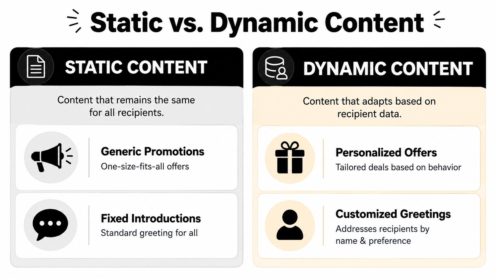
Merge fields are the starting point
Many organizations begin personalization with the obvious field: first name. That is fine, but it is not where the true value comes from. Personalization becomes useful when it changes the message in a relevant way.
| Static version | Dynamic version |
|---|---|
| "Hi there, check out our new arrivals." | "Hi Sarah, your saved category has new arrivals." |
| "Explore our platform." | "Complete your setup and invite your team." |
The change is not only the greeting. The message aligns with context.
For e-commerce, useful merge fields often include first name, product category interest, location, loyalty status, or recent purchase context. For SaaS, useful fields might include plan type, feature usage, account owner name, or lifecycle stage.
Conditional content makes the template smarter
Conditional logic is where the template system starts doing real work. Instead of building separate emails for every audience segment, you use rules to swap modules in or out.
A SaaS product-update email can use the same header, typography, CTA styling, and footer for everyone. But trial users see a "finish setup" block, while active customers see a "try this advanced workflow" block.
An e-commerce version might keep the same promo shell while changing the center section:
- Returning buyer: Show recommendations related to past orders.
- New subscriber: Show bestsellers and brand introduction.
- Cart browser: Show recently viewed or related products.
- VIP segment: Show early-access messaging.
Good dynamic content changes the message because the recipient changed, not because the marketer wanted novelty.
There is a trade-off. The more conditional logic you add, the more QA complexity you create. That does not mean avoid it. It means every reusable template system should include a content map showing which modules appear for which audience conditions.
The other trap is overpersonalization. If the data is weak, stale, or incomplete, generic but clear messaging will outperform awkward "personalized" copy.
The Pre-Flight Checklist for Testing and QA
Email QA should feel less like proofreading and more like a pilot's pre-flight routine. The goal is not perfectionism. It is preventing predictable mistakes before they reach the list.
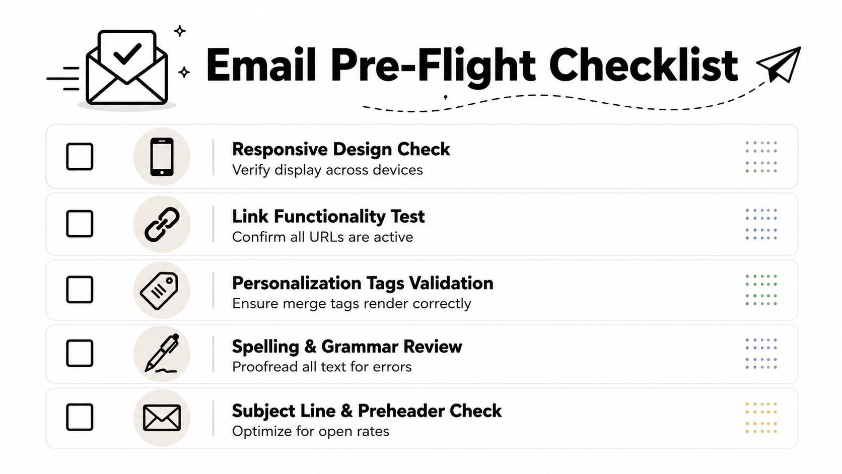
Rendering and device checks
The inbox your team uses internally is not enough. Test across major environments, especially Gmail, Outlook, and Apple Mail, then check mobile and dark mode.
Use inbox preview tools such as Litmus or Email on Acid when possible. Even if you do not have those on every send, establish a manual checklist.
Run through these checks before launch:
- Mobile display: Confirm the template stacks cleanly, text remains readable, and buttons are easy to tap.
- Desktop rendering: Check spacing, alignment, and image scaling in major clients.
- Dark mode behavior: Review whether logos, text, and buttons stay visible when colors shift.
- Image blocking: Make sure the email still communicates when images are turned off.
Function and deliverability checks
Rendering is only one part of QA. The email also has to function correctly and avoid obvious delivery issues.
Use this checklist:
- Link review: Click every CTA, logo link, footer link, and social icon.
- Personalization validation: Preview the email with multiple contact records, including records with missing data.
- Alt text and copy review: Scan for spelling errors, awkward line breaks, and missing alt attributes.
- Footer compliance: Confirm subscription controls, company information, and reply expectations.
- List hygiene: If you are sending to B2B contacts, verification can reduce avoidable address issues before launch.
One broken link can undo an otherwise strong campaign. QA is cheaper than apology emails.
Pay attention to content balance as well. If the email is mostly image and very little text, it becomes harder to read, harder to scan, and more likely to underperform. Let the copy carry the message, with visuals supporting it.
Deploying and Maintaining Your Template System
Once the template works, turn it into a managed asset. Save the coded version and the builder version if your team uses an ESP with drag-and-drop editing. Add short notes explaining what each block is for, what content belongs in it, and what should stay locked.
Set governance early. Decide who can edit structure, who can edit copy only, and who approves changes to global elements like headers, buttons, legal copy, and subscription language. Without governance, a template system drifts into inconsistency.
Review the system on a schedule. Brands evolve. Legal requirements change. Product teams add new use cases. Your template library should improve over time, not turn into a folder of outdated modules no one trusts.
The next layer is AI-assisted assembly. AI can help generate copy variations, suggest subject lines, or assemble modules faster, but it still needs a dependable framework underneath. A strong template system gives AI cleaner rules to work inside.
Mailneo helps teams create, organize, and scale reusable email workflows with the structure needed for future personalization and automation. If you want a simpler way to turn these principles into repeatable campaigns, explore Mailneo.
Explore: Email Design & Content
Related Articles
How to Create Email Templates That Convert
Email templates that convert share five traits: a single clear CTA, a hero section that answers 'why should I read this', one-column mobile-first layouts, preheader text that extends the subject line, and a scannable F-pattern body that respects how people actually read inboxes.
HTML Email Basics: Examples, Structure, and Testing
HTML email is an email built with markup, inline styles, and layout patterns that email clients can render. It is not the same as a web page. Tables, fallbacks, accessibility, image handling, and client testing matter more than modern CSS tricks.
Email Plain Text vs HTML: The 2026 Decision Guide
Plain text and HTML email each work in different contexts. This guide compares deliverability, engagement, tracking, accessibility, branding, and AI spam-filter behavior so teams can choose the right format for each campaign.
Mailto Link HTML Guide: Syntax, Examples, and Pitfalls
A mailto link opens the user's email client with a prefilled recipient, subject, body, cc, or bcc field. It is useful for simple contact actions, but it is not a form replacement. This guide shows the exact HTML syntax, encoding rules, and mistakes to avoid.
Ready to supercharge your email marketing?
Start sending smarter emails with AI-powered campaigns. No credit card required.
Get Started Free