How to Write Newsletters People Actually Read in 2026
Writing newsletters people read in 2026 means defining one clear business goal, segmenting before you write, structuring each send for scanners, and testing the metrics that prove readers actually care.

Most advice on how to write newsletters stops at "be valuable" and "write catchy subject lines." That's not a method; it's a mood.
Newsletters that hold an audience come from a system: one clear job per send, segments decided before the writing starts, a structure built for people who skim, and a habit of testing what the audience responds to. The craft matters, but it matters second. A beautifully written email to the wrong list on the wrong premise still fails.
If you want the broader picture of how email performance is shifting, the roundup of email marketing statistics for 2026 is useful context. The tactical point is simpler; teams that treat the newsletter as an operating discipline get more out of the same list than teams that "just send updates."
Decide what the newsletter is for
Pick one primary outcome. Not three. One.
A newsletter can support several business functions over time, but each individual send needs a dominant purpose. An e-commerce newsletter drives repeat purchases and recovers attention between launches. A SaaS newsletter increases product adoption and reduces confusion. An agency newsletter builds authority with people who are not ready to buy yet.
When teams skip this, the email becomes a pile of mixed intentions. A product update sits next to a blog post, a founder note, and a sales CTA; nothing feels important because everything is competing for the same attention.

A planning habit that forces clarity: finish the sentence "if this newsletter works, the reader will..." before you write a word. Click to view a product. Try a feature. Book a call. Reply with a question. If you can't finish it, you're not ready to draft.
The same discipline applies to the signup promise. Subscribers stay when they know what's coming and how often. "Weekly growth ideas for Shopify brands" and "one useful client acquisition lesson every Friday" are promises; "marketing news and updates" is not. Name the reader, state the benefit, set a cadence you can actually hold, and decide the content mix before launch rather than improvising it in month three. A durable newsletter feels narrow on purpose; that's a strength.
Segment before you write
Different readers need different reasons to care, and the segments are usually obvious once you look.
| Business type | Segment 1 | Segment 2 | Segment 3 |
|---|---|---|---|
| E-commerce | New subscribers | First-time buyers | Repeat customers |
| SaaS | Trial users | Active paid users | At-risk or low-usage users |
| Agency | New leads | Warm prospects | Current clients |
Those buckets change the content naturally. A new subscriber needs orientation and a reason to trust you. A repeat customer responds to curated recommendations. A trial user needs friction removed; an active customer needs examples of deeper use.
Most newsletter problems surface later as "engagement issues," but they usually started as targeting issues. The guide to email list segmentation covers the setup; if growing the list is still the bottleneck, growing your newsletter to the first 1,000 subscribers connects audience strategy to acquisition.
Win the inbox preview
Subscribers don't evaluate a subject line in isolation. They see a small package: sender name, subject line, preheader, and often the first visible words of the body. Each piece should carry a different part of the message.
Subject lines work when they answer one question fast: why open this now? Make it specific, use the preheader to add information instead of repeating the subject, and personalize only when the relevance behind the merge tag is real. A personalized subject over a generic body costs you more trust than it buys.
| Business type | Weak subject line | Stronger subject line |
|---|---|---|
| E-commerce | New Arrivals Newsletter | 5 new arrivals built for warm-weather travel |
| SaaS | Product Update | New reporting filters for weekly revenue reviews |
| Agency | Friday Email | How we cut paid search waste in 14 days |
The pattern in the left column is that the label describes the format. Good subject lines describe the value; nobody has ever opened an email because it was a newsletter. The newsletter subject line collection has more patterns worth stealing, and the subject line tester will flag length and clarity problems before you send.
AI helps here if you use it for range rather than for answers. Generate angle variations per segment, pick the two you'd defend, test those. Asking a model for one "high-performing" subject line and sending it blind produces exactly the copy everyone else is sending.
Structure the body for scanners
Opens get the attention; reading behavior produces the revenue.
Most people read newsletters on a phone, standing up, between other things. That changes what the first screen has to do. Long intros, oversized hero images, and slow creative all push the useful part of the email below where anyone will look.
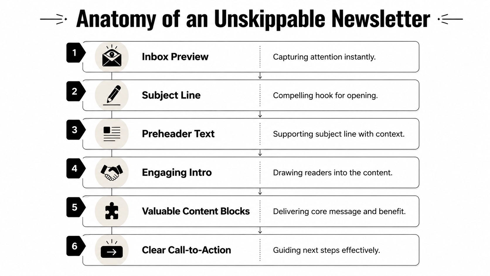
Lead with the main idea; put the core offer, insight, or update near the top. Add proof or context immediately after, showing why it matters rather than everything you know about it. Use modular blocks so readers get clear entry points and your team gets a repeatable frame. Then demote the secondary items; useful extras belong below the primary action, not beside it at equal visual weight.
| Newsletter element | What it should do | What usually goes wrong |
|---|---|---|
| Top block | Explain the main value in one screen | Decorative header pushes the point down |
| Proof block | Add credibility with example, result, or detail | Too much explanation before any payoff |
| Secondary content | Offer optional depth for interested readers | Every item looks equally important |
| Footer | Confirm identity, preferences, and unsubscribe path | Compliance links are hidden or hard to tap |
Shorter usually wins, though "short" depends on intent. A promotional e-commerce send can work in three tight blocks; a SaaS newsletter carrying one product lesson and one customer example can justify more copy if the hierarchy is clear. The question isn't word count. It's whether each section earns its place.
Every send needs one primary action, and only one. If you include secondary links, reduce their visual weight so they don't compete. This is where agency and SaaS newsletters fail most often: a blog post, a webinar, a product update, a case study, and a sales CTA all crammed into one email, followed by confusion about why the clicks fragmented across five destinations and none of them mattered.
The footer does real work too. It identifies the sender, reminds the reader why they're getting this, and makes leaving easy. That protects list quality, and letting disengaged subscribers go protects the engagement signals your future campaigns depend on.
Copy that sounds like one person
Inbox copy loses when it sounds negotiated. The strongest newsletters read like one informed person making one useful point.
Start with the sharpest idea in the email, then add proof and context in the order a busy reader needs them. Open with information rather than ceremony; "we're excited to share" is four words that tell the reader nothing. Use specifics, because "see which campaigns drove repeat purchases" is a promise and "gain better visibility" is a shrug. Write for skimming with short paragraphs and subheads that carry meaning on their own.
I use one test before approving copy: if the first two lines don't answer "why should I care," the draft isn't ready. It's a low bar and most drafts fail it.
Tone follows buyer intent. A fashion brand can lean on pace and sensory language. A B2B SaaS company gets more from clarity and proof. Agencies have the most room for point of view, but only if the advice underneath is concrete; opinion without evidence reads as posturing, and readers are unusually good at spotting it.
Design for the phone
Email design has one job: make the message easy to understand on a small screen held at arm's length.
Single-column layouts beat complex grids in almost every newsletter format. Body copy around 14 to 16 pixels holds up on mobile. Spacing is part of the hierarchy, and crowded emails feel longer than they are. Buttons need high contrast, clear labels, and enough padding to hit with a thumb. Support dark mode where you can; logos and icons that vanish against an inverted background are a surprisingly common own goal.

Images should earn their space. If a visual doesn't clarify the offer, show the product, explain the workflow, or add proof, cut it.
| If the image does this | Keep it |
|---|---|
| Shows the product clearly | Yes |
| Explains a feature or workflow | Yes |
| Reinforces a customer story | Yes |
| Adds mood but no information | Probably not |
The trade-off does shift by format. E-commerce needs product imagery because the image is doing the selling. SaaS gets more from an annotated screenshot than from a stock photo of a team high-fiving. Agencies often outperform polished layouts with a text-led format plus one chart or teardown.
Personalization that changes the message
A first name in the subject line is personalization in the same way a name tag is a conversation. Useful, sometimes; limited, always.
The version that moves numbers is behavioral. Show different products to new versus repeat buyers. Send different education to trial users than to mature customers. Give agency clients strategic insight and give prospects a diagnostic point of view. Relevance is upstream of every other metric in this article, which is why serious teams build the capability early rather than treating it as an optimization. The email personalization guide covers the mechanics, including the parts that need no AI at all.
Send timing is worth treating the same way. Rather than defending a fixed Tuesday slot on habit, check the send time data for your audience type, then test against your own list; the right answer for a B2B list and a consumer list rarely match.
Run tests that teach you something
Random testing creates random learning. Structured testing compounds.
Test one variable at a time when you can. Subject line against subject line. CTA wording against CTA wording. Send time against send time. Change everything at once and you'll get a result you can't attribute, which is worse than no result because you'll act on it anyway.
A clean routine looks like this. Pick one audience slice rather than mixing subscriber types inside a single learning goal. Choose one variable; the subject line is usually the fastest place to start. Write variants that are genuinely different, because a two-word change rarely produces a signal you can read. Let the test window close before you declare a winner, and check whether the gap is real with the A/B test calculator instead of eyeballing it. Then log the result, because an insight nobody wrote down disappears by next Thursday.
Good testing doesn't chase novelty. It builds a house style for what your audience responds to.
Read the metrics in context
Metrics only help when you interpret them together.
Open rate tells you about inbox performance and relevance at the preview stage, with the caveat that privacy features have made it noisier than it used to be. Click rate tells you whether the body carried interest forward, and click-to-open separates a content problem from a subject line problem. Conversion tells you whether the post-click experience matched the promise. Unsubscribe rate tells you whether the send felt mistimed or excessive.
Read them as a set. A high open rate with weak clicks points to a strong subject line over a weak body. A healthy click rate with poor conversion usually means friction on the landing page rather than a problem with the email. Rising unsubscribes almost always mean the content has drifted from the promise people signed up for.
Published industry benchmarks are useful for orientation and dangerous as targets; compare a send to your own history first. The teams that get good at this aren't just good writers. They're consistent editors of their own system.
Three formats to start from
Templates work when they preserve strategy instead of forcing every brand into the same shape. These are deliberately simple; the newsletter swipe file has fuller examples to adapt.
E-commerce product launch
Lead the subject with the product or the problem it solves. Open with a hero image of the product in use, one short paragraph on why it matters now, two or three bullets on what stands out, a primary CTA to shop, and a secondary module with social proof or related picks.
E-commerce readers decide fast. They don't need a founder essay before the offer; they need a clear reason to look.
SaaS feature update
Name the feature and the workflow improvement in the subject. Open on the user's pain point, show a screenshot or short explanation, list what the user can do now, and end with a CTA to try it or read the walkthrough.
Plain language beats hype in this format. "You can now group tasks by account owner" is stronger than "a powerful enhancement to your productivity ecosystem," which describes nothing.
Agency insight
Lead with the takeaway, not "our latest thoughts." One sharp insight from recent client work, a brief explanation of why it matters right now, one practical recommendation, then a CTA to read more, reply, or book a conversation.
This format keeps agencies out of the self-congratulation trap. Readers care about the lesson they can apply on Monday, not the internal process that produced it.
For ready-made structures across other goals, the collection of email templates that convert is a practical place to adapt rather than start blank.
Mailneo helps teams create and manage email campaigns with AI-assisted writing and personalization workflows. If you want a simpler way to turn strategy, templates, and testing into repeatable newsletter production, explore Mailneo.
Explore: Email Marketing Strategy
Related Articles
Newsletter growth: how to get your first 1,000 subscribers
Growing an email list to 1,000 subscribers takes a small set of on-site forms that convert, two or three off-site channels you actually enjoy posting to, and an onboarding sequence that keeps new readers around. This guide covers the realistic timelines, the channel mix that works, the tactics that waste your time, and what to avoid.
Email marketing statistics 2026: 50+ key benchmarks
Email marketing statistics for 2026 show a channel that still outperforms paid social on ROI, still opens mostly on mobile, and still lives or dies by deliverability. Here are 50+ benchmarks across opens, clicks, revenue, automation, AI adoption, and inbox placement, each with a named source.
How to segment your email list for better results
Email segmentation splits your subscriber list into smaller groups based on behavior, demographics, or lifecycle stage so every campaign feels specific instead of generic. Mailchimp's segmented campaigns see roughly 14% higher open rates than non-segmented ones; done right, segmentation is the most impactful thing most senders can do this quarter.
Email personalization: beyond "Hi {First Name}"
Email personalization means adapting subject lines, content, offers, and send times to each subscriber using behavioral and lifecycle data, not just merge tags. Personalized campaigns drive 6x higher transaction rates (Experian), and 71% of consumers expect them (McKinsey). Real lift comes from behavior, not first-name swaps.
Ready to supercharge your email marketing?
Start sending smarter emails with AI-powered campaigns. No credit card required.
Get Started Free